I'm struggling. We need to decide on a color to paint our kitchen and family room. It's times like this that I miss my old neighbor, Jan. She was an interior decorator and really had an eye for these types of decisions.
We went to Hirschfields's last night to decide and came home undecided. The salesclerk that helped us suggested the colors above. We were thinking of going lighter but she said with the dark countertop and backsplash, we should go dark with the walls. There isn't a whole lot of wall in the kitchen that needs to be painted. But then what color to use for the family room? Lighter?
These were two colors I came home with. I just don't know.
This is the adjoining family room and right now it is yellow. If you have any suggestions, I would love to hear them.
We have a tiny bathroom downstairs which had leopard wallpaper until now. I am thinking of painting it turquoise with a thick chartreuse stripe.
My Amish dresser which I ordered in April finally was finished. Since it is made by the Amish, it took 14-16 weeks to get. We are so lucky to have an Amish furniture store just a few hours from here in Lanesboro, MN. We have bought many pieces over the years but it had been a good ten years since we had bought anything.
It was delivered by Jacob of
R & J Wood Goods and I couldn't believe how heavy it was. It was also huge at 55 inches tall and so well made. This isn't from China. I recommend them highly. It wasn't cheap at $1278 but it is something we will have forever. It is replacing a beatup second hand chest of drawers which kept many of Rocketman's things.
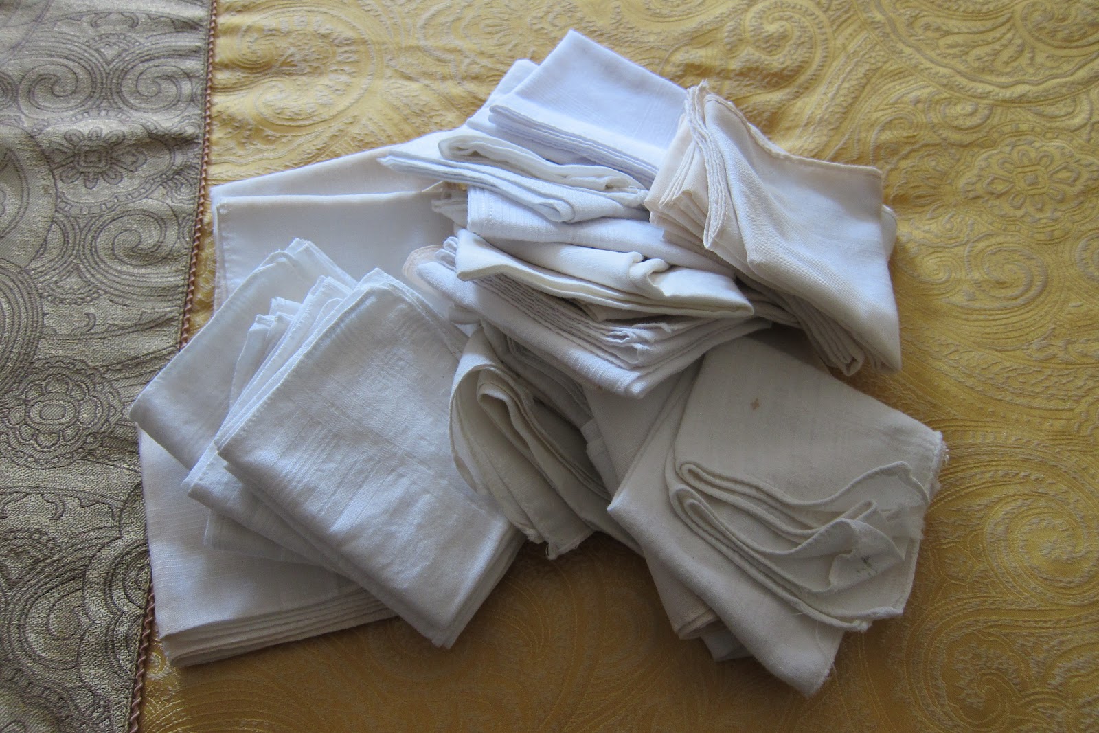
As I was tranferring his things, I came across a plethora of hankerchiefs. He was surprised to see them too. I don't think they had seen the light of day since the 80's.


Becky,
ReplyDeleteI just discovered a site called design-seeds.com
I think of myself as color reticent. I'm not very adventurous when it comes to color. I am enjoying making jewelry and I'm trying to break out some with my color sense. You might find some color path ideas at that site.
Becky, my first thought looking at the tile and the first pic was... warmer...pick up the gold tones in the tile... like your 2nd pic! I personally like the darker one in the 2nd pic but try to get something to blend with the living room. If it bugs you as too dark, do a quick sponge coat of a metallic glaze over it for interest... it picks up the light and makes a wall so much more interesting!
ReplyDeleteThe bathroom sounds GREAT!!!
XOXOXO, H